Product Launch Decks Without a Designer: AI Visuals, Prompts & Layouts
Build a five-slide product launch deck with real screenshots, AI image prompts, editable layouts and an export checklist, without hiring a designer.
 Ofox
Ofox 
A launch presentation does not fail because it lacks another decorative image. It fails when the audience cannot tell what the product does, why the problem matters, or what to do next. For a founder or marketer working without a designer, the most useful shortcut is a repeatable slide structure: one claim, one visual and one next thought per slide.
Start with five slides: product promise, problem, feature demonstration, use case and call to action. Use real screenshots for the product, AI-generated images for supporting atmosphere, and editable text for every headline and number. This guide gives you the brief, prompts, layout measurements and checks to build that deck yourself.
The worked example is Fieldnote, a fictional project-handoff tool. Its copy is a teaching example, not a customer case or tested product. The image prompts below are templates, not claimed generation results. An Ofox interface screenshot is explicitly dated; ChatSlide’s optional workflow is described from its public documentation, not an end-to-end account test.
Download the launch brief, prompts and checklist.
1. Write the source brief before generating slides
You need a slide editor, three to five approved product facts, a real screenshot you are allowed to publish, your logo and an image tool if you want supporting illustrations. PowerPoint is sufficient for the manual assembly steps below. A paid AI presentation plan is not a prerequisite for following the layout method.
Make one folder with source, images, deck and exports subfolders. Keep the original screenshot in source; work from copies. Before capturing it, switch to a demo workspace and remove account identifiers, customer records, balances, access tokens and unrelated tabs. Cropping private material out of the published screenshot is safer than placing a removable rectangle over it in a slide.
Fill in this brief first. For each fact, record where you verified it. If you cannot supply evidence, narrow the claim or remove it.
Product: Fieldnote [fictional teaching example]
Audience: small teams handing projects from one person to another
Problem: status, decisions and open questions live in separate messages
Product promise: keep the next handoff in one shared project note
Approved features for this example:
- named owners
- a next-action checklist
- a handoff summary
Evidence assets to supply for a real product:
- demo-workspace screenshot of the handoff note
- screenshot crop showing the checklist and owner fields
Claims to exclude:
- invented time savings, customer counts, integrations or testimonials
Launch action: open the demo project
Destination: [your actual demo URL]
Visual direction: off-white background, dark text, one orange accent
Format: five slides, 16:9, editable text
This source brief does two jobs. It prevents an outline model from improvising features, and it gives you a way to reject a good-looking slide that is wrong. A promise such as “Never miss another handoff” is too absolute. “Put owners and next steps in the same handoff note” is specific enough to demonstrate.
2. Turn the brief into a five-slide launch story
Write the headline of every slide before selecting a theme. Read only those five lines aloud: they should form a coherent explanation. If they sound like five unrelated slogans, fix the story now.
| Slide | Example headline | What the visual must show | What you explain aloud |
|---|---|---|---|
| 1. Promise | Keep the next handoff in one place | Product name and a restrained contextual image | Who the product is for and the job it helps them do |
| 2. Problem | The next owner needs more than a chat thread | Three short, editable labels: status, decisions, next steps | One recognizable handoff situation, without invented statistics |
| 3. Demonstration | See the owner and the next action together | A real, readable crop of the product interface | Where the owner is assigned and where the next step is recorded |
| 4. Use case | Hand a client project to the next teammate | Three editable steps: capture, assign, hand over | Inputs, the person taking over and the output they receive |
| 5. Action | Open a demo project and try one handoff | One action, a working destination and optional screenshot thumbnail | Exactly what the audience can try after the presentation |
These are five slide roles, not a rule that every launch must fit five pages. A live demonstration may need two feature slides. A complex procurement audience may need security and implementation details. An investor deck needs business evidence beyond this launch story. Add a page only when it answers a new question.
Use the following prompt with a text model to draft your own storyboard. For repeatable document and slide prompting, the Sonnet document, slide and spreadsheet guide covers a broader artifact workflow.
Create a five-slide product launch storyboard using only the brief below.
Audience: [specific audience]
Brief: [paste the completed, verified source brief]

Return a table with:
slide number, headline, on-slide copy, visual instruction,
speaker note, evidence asset and unsupported claims to remove.

Use these roles in order:
1 promise, 2 problem, 3 real feature demonstration,
4 use case, 5 one next action.
Use one sentence for each headline and no more than three short
supporting lines per slide. Put explanation in speaker notes.
Do not invent product screens, performance metrics, customers,
testimonials, integrations, prices or launch dates.
Mark missing evidence as [NEEDS SOURCE].
Do not turn a planned feature into a released feature.
Treat the result as a draft. Replace every [NEEDS SOURCE] before publication. In the Fieldnote example, “cut handoff time by 50%” would be rejected even if the model made it the strongest headline. No measurement was supplied.
3. Separate product evidence from supporting AI visuals
Give each image a job before you generate it. A real screenshot proves where something exists in the interface. A decorative scene can set the tone, but it cannot prove that a feature works. A diagram can explain a workflow if its labels come from the verified brief.
For this five-slide deck, start with two visual assets: one supporting cover image and one real product screenshot. Build the problem and use-case slides from editable text and shapes. Reuse a small crop of the screenshot on the final slide if needed. That is a design choice for this example, not a claim that two images are universally optimal.
Ofox provides image-generation and model API entry points. For an individual deck, use the image workspace available to your account; developers can instead follow the OpenAI-compatible image API documentation. Neither route establishes an automatic connection to ChatSlide: export the image and insert it into your chosen editor yourself.
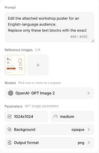
Ofox reference-image preparation interface, captured September 29, 2026 for an earlier poster task. It illustrates the separation of prompt, reference and output settings; it is not a generation result from this launch-deck tutorial. Available models and controls may change.
For a slide-centered image workflow, ChatSlide’s AI image generator is another option: its public feature page describes generating images and placing them into presentations, slides and posters. Keep the same source brief and image requirements whichever tool you use. Check the options available in your account before generating; this guide makes no claim about plan allowances, generation speed or export entitlements.
Write a style block you can reuse
Copy the same visual constraints into each image prompt. Change the subject or framing deliberately; changing the model, palette and lighting together makes the source of inconsistency hard to identify.
STYLE BLOCK
Editorial still life for a calm business presentation.
Warm off-white background, charcoal details, muted orange accents.
Soft daylight, gentle shadows, simple materials, uncluttered scene.
No text, no letters, no logos, no watermark, no invented app interface.
Keep all important objects away from the outer edges.
This block is an instruction, not a guarantee that the model will obey it. Inspect every result. If you already have a reference image and the selected model supports reference inputs, supply that image with the same style block rather than relying entirely on repeated adjectives.
Prompt for the cover image
[Paste STYLE BLOCK above.]
Create a horizontal supporting image for a product launch presentation.
On the right side, show a neat stack of unmarked project folders
with one folder open, suggesting an organized handoff between teammates.
Keep the left half mostly empty and evenly lit for a separate headline.
No people, no screens, no diagrams, no visible writing.
The image is a visual metaphor, not a screenshot of the product.
Compose for a 16:9 frame where supported.
Choose a wide output setting if it is available. If the model only offers a different shape, plan a crop or put the image inside a smaller frame. Do not stretch a square image across a widescreen slide. Generate one candidate, inspect it in the actual layout, then decide whether a second attempt is needed; requesting a large batch before testing the composition can waste effort.
Prompt for a correction
Edit the attached supporting image.
Preserve the folders, materials, lighting and overall palette.
Move the visible objects into the right half of the composition.
Leave the left half clear and low-detail for editable slide text.
Remove any accidental letters, logos or markings.
Do not add product screens or change the scene into an infographic.
Use this only with a model and workflow that accept image editing. Otherwise regenerate with the corrected framing in the original prompt. A model may still alter objects during an edit; compare the output with the reference rather than assuming “preserve” is exact.
Save the accepted file as cover-visual.png. Keep a separate product-demo.png for the real screenshot. A useful acceptance test is whether a reader can distinguish the atmospheric illustration from the product evidence without a verbal explanation.
4. Assemble the deck with a layout you can repeat
Choose 16:9 before inserting assets. In PowerPoint, use Design → Slide Size → Widescreen (16:9); Microsoft documents the slide-size setting and its effect on existing content. If a venue requires a different format, use its specification from the beginning.
Create five blank slides. Choose one readable font available on the machine that will present the deck. For this example, start with 32–40 pt headlines and 20–24 pt supporting text. These are starting values for this layout: test at the intended viewing distance rather than treating font size alone as proof of readability.
Use roughly 6% of slide width as the left and right margin. Keep the title in the upper fifth. For a two-column slide, use about 35% of the width for text, 5% for the gap and 48% for the visual; the two outside margins consume the remaining 12%. The proportions sum to the slide width and are easy to reproduce with alignment guides. They are recommended layout proportions, not a software requirement.
Slide 1: promise and context
Insert cover-visual.png using Insert → Pictures and keep its proportions. Put the headline in a separate text box over the clear area or in the left column. Add the product name above it and one explanatory line below: “A shared note for project owners and their next steps.” Replace that line with your own verified promise.
Do not ask an image model to draw the entire cover, including the title. Separate text remains editable, searchable and easier to revise. If the image competes with the headline, use a solid background for the text column instead of reducing the text until it disappears.
Slide 2: make the problem recognizable
Use a short headline and three text boxes labeled “Status,” “Decisions” and “Next steps.” Beneath each, describe where that information currently gets lost. In the fictional example: “last week’s message,” “a separate call,” and “someone’s checklist.” Label the scenario as illustrative if it could be mistaken for customer research.
Keep this slide visually quieter than the cover. An invented dashboard or fabricated customer quote would add apparent authority without evidence. If you have real, publishable customer research, substitute it and retain the source in your notes.
Slide 3: show the product rather than describe everything
Insert the real screenshot in the larger right column. Crop out empty space, but retain enough context to identify the screen. Use up to two callouts outside the image: “Owner” and “Next action” for Fieldnote’s hypothetical interface. Your real product must actually contain the fields you label.
If the screenshot’s labels are too small at presentation size, use a closer crop or split the demonstration into two slides. Sharpening a tiny full-page screenshot does not make its contents easier to read. Never replace hard-to-read real text with AI-invented interface text.
Slide 4: show a complete use case
Create three aligned boxes with arrows between them. For the example: “Capture decisions → Assign the next owner → Hand over the note.” Add one input and one output beneath the diagram: “Input: current project context” and “Output: a note the next teammate can act on.”
Explain what remains manual. If a person must confirm the owner or send the note, say so. Do not suggest an automation or integration merely because arrows make the diagram look automatic.
Slide 5: give the audience one action
Use “Open a demo project and try one handoff” only if a demo actually exists. Otherwise choose an available action such as visiting a product page or requesting access. Add a clickable destination to the text. If you include a QR code, retain a readable URL as a fallback and test both after export.
Avoid placing a sales call, a newsletter sign-up and a trial link at equal prominence. The reader should know which one advances the task you just demonstrated.
5. Use an AI presentation builder without losing control of the story
If you prefer assisted assembly, ChatSlide’s published workflow describes supplying source content, reviewing an outline, selecting a theme, generating slides and editing the result. Use the five-slide storyboard as your input. Keep the verified facts and the “claims to exclude” section with it, then review the outline before proceeding.
Check whether the editor and plan you are using support the uploads and export format you need. If they do not, the manual PowerPoint route above remains usable with the same brief and image files. A tool’s public description is not proof that every capability is enabled in every account.
After generation, compare each page with the storyboard. Replace any invented interface with your real screenshot. Keep generated decorative imagery separate from evidence, and restore any qualified statements the tool has made absolute. You have finished the draft only when every claim can be traced to the source brief.
6. Export, reopen and rehearse before sending
Save the editable deck first, then export a PDF for review when that suits your delivery channel. In PowerPoint, use the available Save As, Export or Download As controls for your version. Open the exported file independently: reviewing only the editor misses font substitutions, clipping and link failures introduced during export.
For each slide, read the headline at normal presentation size, check the image crop, click the action link and verify that product names and numbers are still editable in the source deck. Check reading order and alternative text in the editor when those accessibility controls are available. A flattened screenshot of a whole slide is not a substitute for its editable text.
Use this final checklist:
- The five headlines tell a complete story without the speaker notes.
- Every product feature and number has a source; illustrative examples are labeled.
- Real UI screenshots are readable and contain no private information.
- AI images carry no accidental text, false logos or fake product controls.
- Each slide has one clear visual priority, consistent margins and adequate contrast.
- The exported file opens correctly and every destination works.
- The final slide gives one action the audience can take today.
Rehearse once using the exported version and the actual sharing setup. If you need to explain why a screenshot is unreadable, change the screenshot. If a slide needs a paragraph of qualifications, revise its headline. Once the deck works, you can reuse its source assets in a product demo video from screenshots, but check the pacing and captions for that separate format.
Common problems and the smallest useful fix
| Problem | Likely cause | Fix |
|---|---|---|
| The deck looks polished but says little | Theme selected before the story | Rewrite the five headlines and choose one proof per slide |
| Images change style from page to page | Prompt, model and reference change together | Keep the same style block and reference where supported; simplify to fewer images |
| The picture leaves no room for a title | Framing was omitted from the prompt | Move the subject to one side, crop deliberately or give text its own solid column |
| Product text is wrong | AI generated or altered the interface | Replace it with an approved real screenshot and editable callouts |
| A feature claim is unsupported | The outline filled gaps in the brief | Remove it or obtain a source; do not present a planned feature as available |
| Text clips after export | Font substitution or oversized text boxes | Use available fonts, resize the text box and reopen a fresh export |
| An export option is missing | The account or editor has different capabilities | Use a supported format or assemble manually; do not promise an unverified paid entitlement |
Questions before your first launch deck
Do I need a designer for a product launch presentation?
You can build a focused deck with a consistent layout, real screenshots and restrained supporting images. A designer can help with complex visual systems or a high-stakes event, but this workflow gives a small team a practical starting point. It does not replace product verification or audience feedback.
Should the whole presentation be AI-generated?
Use AI for drafts and supporting assets where it saves work. Keep ownership of the storyline, sources, product screenshots and final checks. A deck assembled entirely by a model still needs that review; generating more pages does not provide better evidence.
What should I prepare first?
Complete the source brief, collect an approved screenshot and write the five headlines. Then create one cover visual and assemble the demonstration slide. Those two pages expose most framing and readability problems before you spend time polishing the rest.
Editorial disclosure: this article was prepared as part of a no-fee content collaboration with ChatSlide. Product descriptions are based on the public pages checked on October 9, 2026; the workflow is not a comparative product benchmark.
Frequently Asked Questions
- What should a product launch deck include?
- Start with the product promise, the customer problem, a real feature demonstration, a concrete use case and one next action. Add evidence where available, and leave unsupported numbers out.
- Can AI generate the entire presentation?
- AI can help draft the outline and supporting images, but you still need to check product facts, preserve real screenshots, adjust layouts and review the exported file.
- Should I use AI-generated product screenshots?
- Use real screenshots to demonstrate an existing product. Label concept mockups clearly and keep them separate from evidence of functionality.